Showing posts with label Arty Farty. Show all posts

Saturday, 17 January 2015

Lumpy Space Princess Collage

I am a frequent watcher of a weekly Ustream by Karen Ellis of The Art House Studio.  In one of her streams she used the Brother Scan-N-Cut to make a mask and a stencil for a project involving Dr. Who and the phrase "Fezzes are cool."  I knew straight away I wanted to do something with the technique with Lumpy Space Princess.  I drew her on paper and cut her out for a mask and made a collage of cut out images of her from a magazine and some stickers,  sealed it with gel medium and masked off her shape.  I painted the negative space first with purple and later with dark blue because the purple didn't provide enough contrast.  I over painted the collage as well to dull down some of the more distracting elements.  Lastly, I painted her tagline on the bottom.  Voilà!

If you'd like to see the original tutorial,  look up The Art House Studio on Ustream or Karen Ellis on YouTube.  Karen's blog is at:

http://thearthousestudio.ca

Check her out for arty crafty goodness.

Friday, 16 January 2015

Arty day!

I had a friend over for a little crafty arty session.  I was determined to do something that I had been turning over and over in my head for a while. 

This canvas is done using a subtractive technique.  I laid the colours down in patches on the background and painted over it in the negative space.  I don't think I chose the right shape for my first attempt at this technique.  I may try something easier next time.

Some of my thicker paints are getting old and can be used to add texture as well as colour.  I spread some of it through a stencil using a palette knife and the result shows all over the place.  I love what it did!

I will definitely be making more canvases.  I have a slightly caved in one that I will be experimenting on, using fabrics and beads to embellish my mixed media backgrounds and textures.  Hooray!

Monday, 5 January 2015

Mixed Media Appearances

I have decided this year to participate in Creative Jumpstart 2015.  It's running throughout the month of January and has 25 videos by mixed media artists and crafters.  Check out www.nathaliesstudio.com for details.  There are giveaways as well by the sponsor, Liquitex. It is by paid subscription, but at $25 USD it is a very good value.  The videos are accessible until the end of November,  so if you fall behind or if life happens as it often does, you can pick up where you left off.

This piece was made to illustrate a few of the main points I found valuable from the first video.... but I can't tell you!  Go join. :)

Wednesday, 10 July 2013

Arty Dollhouse Makeover!

My little girl has a dollhouse that has been passed down to her.  It had been written on with felt tips long ago and it needs a facelift.  I decided this would be a great opportunity to try out some chalk paint, so I went to The Vintage Dove in Elm Court, Gillingham and bought a couple of tester pots in Pebble and Swedish Blue.  I used this dollhouse as a testing ground for the paint and I'm very happy with the finish.  But we're not done yet!!!


Plans for this house are in constant flux.  At the moment, I am planning trellises, leaves, vines, flowers and lots of fun decoration around the windows and doors.

I will revisit this project as progress is made, so stay tuned!

Monday, 8 July 2013

Messing About on Canvas.


I love to use acrylic paint on my wooden mirrors and other useful items for around the house, but I haven't until recently started painting on canvas.

I live in a rented house at the moment and there are lots of nails on the walls that have been left behind and painted over.  I have been slowly using them up over the ten-or-so months I've been there.   It's starting to look a bit like a museum now!

These two canvases were made during half-term holiday when my friend Crafty Frank  (not her real name) came to stay.  We enjoy having our child-free time to create.

The one on the right was made using Crafters Workshop stencils and the plastic netting that fruit and vegetables sometimes come in.  I love the variety of colours and textures in this piece.  I'm not quite ready to let go of it.   Besides,  it matches my curtains perfectly!

The one on the left was inspired by a piece I saw on Pinterest.  By the time I had finished it, however, it had  taken on a life of its own and barely resembles my inspiration piece.  I showed a friend at my regular Wednesday Crafty Cafe.  She was impressed with it and said, "Are you going to sell it?"  I jokingly put a price out there and she said, "We have a deal!"  Totally blindsided me.  Okay, so... I'm selling now!

Sunday, 7 July 2013

Pebble Crackle Mirror

Another day, another Ikea mirror.  This time, I have used a fantastic paint by Viva Decor called Croco.  It is a one-step crackle paint with quite a heavy body.  It's also a bit pearlescent.  Each of these pictures will show a slightly different colour because I have varied the angle.


I have applied the Viva Decor Croco paint generously through a Crafters Workshop stencil called Mini Pebbles.  I used a palette knife and skimmed the paint thickly over the top, carefully lifting the stencil straight up to reveal quite thick shapes.  I worked in sections and came back to it after days, if not weeks.  I used a mix of Azure and Turqoise for this mirror.


The great thing about Croco is that the thicker you apply it, the more pronounced the crackle effect will be.


This lovely specimen is not yet finished.  Once it is, if you're in love with it, you may purchase it on my Folksy Shop.  I will be putting all of my mirrors on there eventually.  Just look for the tag "Arty Farty" for the rest of them.

(As I blog this, Folksy is down for maintenance and I can't get the direct link on here.  I think it may be http://www.folksy.com/shops/HapAxStudios  -- but don't quote me on that.)


Saturday, 6 July 2013

Playing with Dylusions!

 Ok, seriously.  This.  Is.  Amazing.  Look at this!!

I was squealing with delight over what happened in this book.  I used only two colours of Dylusions spray inks by Ranger and out comes this fantastic landscape, complete with alien tree trunks ripe for doodling!


I used Bubblegum Pink and Lime Green Dylusions on a pair of art journal pages prepped with a spray of plain water.  The colours wicked into each other and separated into a rainbow of colours reminiscent of a sunset over a green field.  It's much brighter than it came out here in the photos, but you get the idea.  I put the ink on one page, let it do its magic and closed another page over it.  I opened it again and used some scrap to blot off the excess liquid.


I love these summery colours.  I'm not quite sure yet what I'll use the scraps for, but believe me,  they will be used!

Further experimentation has seen the colours come up quite well on kraft paper as well, shown here next to the giant number six.

It's so much fun to play with new supplies.  I need to start using them on actual projects though.  At the moment I feel like a bit of a mad scientist!  Mwah-hah-hah!!!!

Monday, 29 April 2013

Wish notebook


One of the more fun things I enjoy with craft is making things I can use every day.  I love making cards or scrapbook pages, but things like covering cheap notebooks or making my own desk sets means that I can keep something more permanent to look at and enjoy.

These A6 notebooks are from Tesco and they cost 35 pence.  I did my crafty thing with a piece of card and attached it to the notebook.  Simples!!  

I made this one alongside my Crafty Frank.  Hers is fab too, it has a tatoo-ey look to it and it's quite cool!  We use these books to record our card readings.  Very fun!

Monday, 8 April 2013

Another Mirror Frame, Blazing New Trails!


Hmm.... it didn't photograph too well... but here it is!

On Friday night, I watched Karen Ellis on Ustream as I usually do.  She took a bit of MDF and worked her magic on it and it was very cool. :)  She thickly applied structure gel to the wood through a stencil, applied colour to it in her special arty way when the gel dried... then painted a coat of white on and proceeded to remove the white from areas that were raised.  The result was fantastic.  A lot more fantastic, I must say, than what you are seeing here.

I used a 6x6 stencil, repositioned repeatedly to get the entire frame covered,  and I think the pattern is way too intricate to be effective, but lesson learned. :)  I still really like the look of it.  I might dry-brush a bit to try and catch the design a bit more, but I'm going to leave it a while and think about it. :)


Monday, 11 March 2013

Inspired by my House


I live in a 1930's house that has the stained glass windows in the front hall.  I decided to take these motifs as inspiration for my next mirror.

I wanted a little bit of the text effect, so I wrote some random French and  English things about flowers and roses and friends etc and painted over it.

And here it is in situ:


I'm happy with that, although that's all I did this weekend.  :)

Thursday, 28 February 2013

My three mirrors in close-up.

Crackly...

Bumpy...

Goldy...

Sequinny...

Texturey...

Distressy!

Wednesday, 27 February 2013

Coming Through the Ugly Stage.... adding colour.


And it's good-bye to the white!  I used some ancient spray inks for this one:  Moon Glow sprays in Wild Iris and Endless Sky with added distress ink in Faded Jeans.


Now to pop the letters and frames out a bit, I made up just enough paint out of my Primary Elements powders and Simple Solutions (Luminarte)  paint what I needed in toning shades.  I sprinkled some of the pigment powder in Kiwi around the other green elements to add more interest and sprayed with water.

I wasn't satisfied with that though.  I thought it needed one last touch, so I added Sunset Gold Pearl-Ex to bring up some of the texture.


After applying some additional gel medium to the glass microbeads with a pallet knife and adding a bit of spray varnish, I have finally finished the mirror!  Whew.... :)

Tuesday, 26 February 2013

Ugly Stage!


Have I mentioned how I detest taking pictures of square things?

Now before you cringe too much, it's not done.  furthermore, it is in what Karen Ellis would call an "Ugly Stage."  But I'm showing you because I'm just that honest.

If you haven't checked out The Art House Studio on Ustream, you're missing a giggle and lots of inspiration. It's actually broadcast live from Karen Ellis's shop/studio in Canada at 6:30pm her time, which makes it 11:30pm local time here in England.  (Until they start changing the clocks, then it gets weird for a week or two)  This past Friday she was working on a canvas with some dimensional elements and it was really inspiring.  I decided that I'd have a go with the techniques myself.

This mirror (yet another bargain from ikea) was covered in texture paste and some gel medium.  I stuck on some Tim Holtz Grungeboard letters and some chipboard frames.  I sprinkled on some glass microbeads and added some  oddly-shaped sequins and some flat-back gems.  This is where I left it to allow the texture paste to dry.

I'm thinking of making  more "motivational mirrors."  I need some more good quotes to put on them though.  Any ideas would be most welcome!

Next stop.... colour!

Monday, 25 February 2013

Craft-a-Palooza: Catching up with the Purple Mirror


Please forgive the odd angle on this one.  It is now hanging on a wall and I detest pictures of mirrors with cameras in them.  Strange pet peeve, I know... but... that's me.  :P)

Scroll down to see another picture of this mirror from the "before-time."   Before what?  Before Micaceous Iron Oxide.  That's the black stuff you can see in two corners of the mirror.  I decided after much thought that this mirror needed some overlay on the corners that didn't have the texture paste on it.  There's enough space in the design that you can still see all the lovely crackling effects, plus the black stuff has a lovely sparkle to it that you can't see in this photograph.

Close ups and more mirrors to come. :)  This was a Friday Night Craft-a-Palooza job I got done.  I dearly wish I had more to show for four whole days at home without the kids.  So far, I have blogged this, the waistcoat (now finished but probably awaiting customisation, knowing me...) and my art journal page.

There hasn't been  nearly enough crafting, but there has been a bit more, which you will see tomorrow.

Sunday, 24 February 2013

Craft-a-Palooza!


Brighton Model World  is going on this weekend.  I know it's a bit too late by the time you read this to go down there, but I'm pleased to say that my kids are there, and have been since Thursday!  I specifically ring-fenced this time for Craft-a-Palooza, my own personal time to craft and do whatever I want to.  I have been trying to divide my time responsibly (there is still the dreaded housework to be done, after all!) and I think  I've cracked it.

For some reason, the lights aren't working in the kitchen.  They stopped working Friday night sometime.  All I know is I came downstairs from a cat-nap (preparation to stay up late watching The Art House Studio on Ustream) and I had no lights in the kitchen.  Not likely to be a bulb problem as there are three bulbs.  The couldn't all have gone out, could they?  It didn't pop the circuit breaker either, so it wasn't that.  Mystery!

What this has forced me to do is take into account daylight.  I must crochet with daylight coming in through the window over my shoulder.  If I attempt to crochet with the room light on in front of me I will  get eye strain and later on a focal migraine.  I found that natural light from behind me allows me to crochet for a longer time with no eye strain.  Natural daylight is also required for me to use (and clean) the kitchen, so I had to do that before I settled down to craft.   After sunset, I can focus on crafts that I can do with interior lights on, which is pretty much everything else.

In the photo above is a waistcoat I have been making bit by bit since August.  All  I have left to do is sew up the shoulder seams and crochet borders around the armholes and neckline.  It can be done!!  I live in hope.

Saturday, 23 February 2013

Art Journal Mantra


Our family is in home limbo at the moment.  Sometimes my thoughts can become plagued by "when will this all be over?"  or, "Will the house we like still be on the market when our old house sells?"  It's stressful to think of these things, and it's been causing the horrible "hurry up and wait" situation.

In an effort to stay calm about it all, I decided that when I start thinking too much about it, I need to reassure myself that the right house will come along at the right time,  in the right place and at the right price.  I shortened this to, "Right House, Right Place, Right Time, Right Price."  Then I can let go of the stressful thoughts, replace them with some vague positivity and leave it at that.

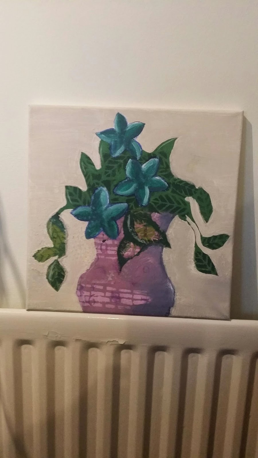
Art journals can be good for focusing thoughts.  I knew I wanted to make some kind of arty/crafty expression of this mantra so that I can picture it in my head as well.  So here it is.

The inspiration for this page came from Joanne Sharpe's Art House which she made for The Art House Studio while she was there teaching some classes.

My Art Journal is a Kraft paper one, which generally means I either need to stick things into it, or prepare the paper first.   My chosen medium for colour was PanPastels.  This determined that I needed to prep the surface.  I experimented on a previous art journal page with gesso and white/cream acrylic paint and decided  on the latter.  In my experience, gesso doesn't make a good surface for PanPastel, probably because it is made with chalk to begin with.  It  also picks up all  the oil from fingerprints or anything else and areas coloured with PanPastel will highlight the oil.  it was an interesting effect, and probably one to keep in mind if I ever want that to happen on purpose.  but for the most part, the PanPastel seemed to prefer the acrylic, so that's what I used.

I made a background full of my mantra, in my own handwriting, using a variety of pens.  I need to play some more and find greater  variety in my writing styles, something that I'm sure a class with Joanne Sharpe will enable me to do.

The colour was added over the top of the writing with the PanPastels. I bought the starter kit Mixed Media 2.  it has some beautiful colours in it and I have used pretty much all of them in this page.  The colours are so vibrant in real life.  The photo really doesn't do it justice.  I sealed it with Pastel Fixative poured into a mini-mister bottle.  I can't get hold of the spray verion at the moment, but this will do and furthermore, it will be cheaper every time I need to refill.  The liquid fixative in a bottle costs less than the spray cans.  Result!

Sunday, 10 February 2013

Another Day, Another Mirror.

I'm not sure whether this one is done or not.  There's a lot of fine detail in the non-textured sections that you might not be able to see, such as fine crackling.  I didn't want to cover it all with the texture paste though, so I might have to be finished with it.

On this and yesterday's mirrors, the first coat of paint was a bright colour that I didn't want to see much of in the final product.  Yesterdays was red at first.  Todays was yellow.  This time, I ended up scrubbing some of the paint back to reveal more of the yellow.


Saturday, 9 February 2013

Mirror mirror on the... Table?

Between other activities today, I have been laying some layers of paint down onto this unfinished wood mirror.  Some of those layers were crackle, so its appearance is still changing as I write this.

I'm so impatient.  I can't stand waiting for paint to dry!  I think it has resulted in some interesting, er, features.


Saturday, 26 January 2013

The Crackle Factor!

I happened upon some acrylic crackle medium this week when I should have been shopping for more practical things.

I had no idea what made the best cracks, so I decided to use my art journal to experiment.

I tried thinly and thickly applying the crackle medium and then putting the paint over the top but got not much crackling at all.  Odd.

Then I tried really blobbing on the crackle medium.  I gave each one different drying times and started to see a result.


I saw some people online using glossy accents underneath Ranger Crackle paint with some great results.  It got me thinking what else I could put between the base layer and the crackle layer to change the characteristics of the crackles.  I tried the paint-only way, then I tried using Klear floor polish.  I have it for other crafty applications so I figured it was worth a try.  Finally, I tried Glossy accents and Prism paper glaze.  The glaze was smelly and requires clean-up with turpentine (White Spirit).  The most dramatic results came from the Prism glaze in the lower right hand corner, but in second place was the way the manufacturers intended at the top.


Crackle Factor:  The Result formed an art journal page at the end of my experimental patches.  I have since painted up some of the pages in between my test pages and they will become background pages made with leftover ink and paint splodges from other projects as I make them.  I like the idea I got from Julie Fei-Fan Balzer about using an art journal page or tag or piece of paper to absorb excess product and act as a starting point for later.

A little note about my art journal:  Not very impressive is it?  I'm using it to experiment and write down what I learn about certain products.  I'm hoping to get into art journaling more but at the moment it's a practice book.

Wednesday, 23 January 2013

Fixed it!


The oddness of the cork area on my art journal has been repaired now.  You may now look at it. :)

You can spot the awkwardness of the previous photo now too, can't you?  Scroll down two or three entries and you'll see it.

I've been out shopping today.  I went to get a clothes drying rack and I came back with said rack, plus three bottles of acrylic paint, one of which is crackle.  I know now what I must do. :)